With modern technology at the touch of our fingertips, visualizing data has never been easier. With just a few clicks of the mouse or a few taps on the screen, we can turn raw numbers into visually pleasing, easily understandable charts that include essential information to make the best business decisions.
But did you know that data visualization actually stems from pre-historic times? Yes, you read that right! Data visualization, or to be exact, turning information into visual elements has been present in the human race for centuries, if not millennia.
Here are some examples of how data visualization was used throughout history.

How Has Data Visualization Developed Throughout History?
Pre-Historic Times
Data visualization may be traced to pre-historic drawings scratched on rocks or in caves. It is possible that the famous Paleolithic cave paintings in Lascaux, southern France, functioned as hunting guides or directions to the spirit world.
Also, ancient civilizations such as Babylonians, Egyptians, Greeks, and Chinese all developed sophisticated ways of representing information visually. They used visualization to mark the movements of the stars, produce maps, and even formulate plans for crop planting and city development.

Cartography
Maps present the first form of data visualizations, and they have been around for at least ten thousand years. Originally created for navigation and land ownership, maps used to look much differently in ancient times.
For example, thousands of years ago, information about the world was collected from eyewitness accounts and then engraved into stone or clay.

The “Flow Map”
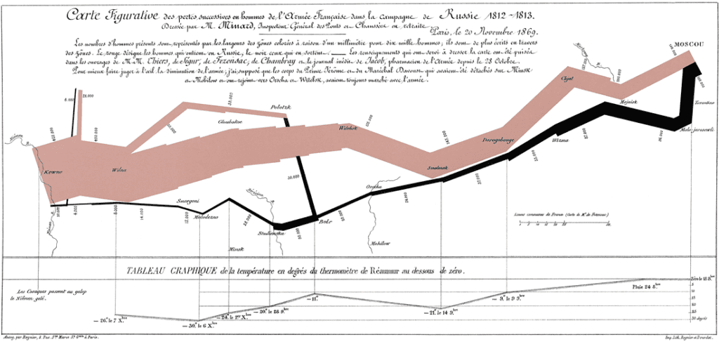
Charles Joseph Minard is a French civil engineer who significantly contributed to the field of data visualization. By combining statistics and cartography, he created a “flow map” of the area around Dijon and Mulhouse in eastern France. The aim of the map was to display traffic data collected on roads throughout the area.
More importantly, Minard is most famous for depicting Napoleon’s disastrous invasion of Russia in 1812. He created a flow diagram that graphically depicts the depletion of Napoleon’s armies from almost half a million to virtually nothing. These types of diagrams are nowadays called “Sankey charts.”

The First 3D Visualizations
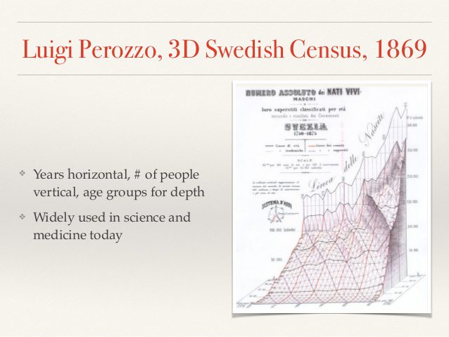
Luigi Perozzo is an Italian statistician who produced one of the first 3D representations of data. He portrayed the age group of the Swedish population between the 18th and 19th centuries. Perozzo created the diagram by measuring the years horizontally, numbers of individuals vertically, and age groups in depth going into and out of the image. Nowadays, the use of 3D to represent data is quite common, especially in medical and engineering sciences.

Poverty and Crime Map
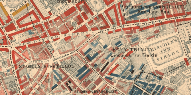
In the late 19th century, Charles Booth created color-coded visualizations of London streets to depict how many Londoners lived in poverty and what caused it. Booth used various colors to mark different social classes and their income. His work proved the value of visualization in political analysis, and he received much attention from the emerging socially progressive politicians of the day.

Data and Computer Processing
Starting with the 20th century, the rebirth of data visualization occurred thanks to the emergence of computer processing. Thanks to computers, statisticians were able to collect and store data in much larger volumes.
By the mid-20th century, data visualization had entered mainstream use and had become commonplace in magazines, cinemas, and newspapers. Later on, during World War II, new computers were developed to handle a vast amount of military intelligence.
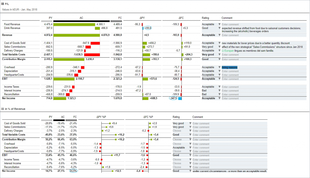
And, by the 1980s, the first full-color computer visualizations appeared along with interactive graphics, providing a brand-new way of revealing the stories hidden in data, making way for Microsoft’s Excel and PowerPoint visualizations, and ultimately, the beautiful dashboards we know and love in our favorite BI tools of today.
Experience IBCS-powered data visualization and reporting with TRUECHART. Start enjoying the perks of data-driven decision-making for your organization today.
Stay up-to-date with TRUECHART. Follow us on LinkedIn.
